Oh, man. I’m so excited.
After a rough start to 2016, I’m finally getting back on track. That’s good for me–and you! Why you? Well, because I know y’all have been waiting . . . and waiting . . . and waiting.
Now, it’s finally time to release Bellanok: The Dragon’s Oath!
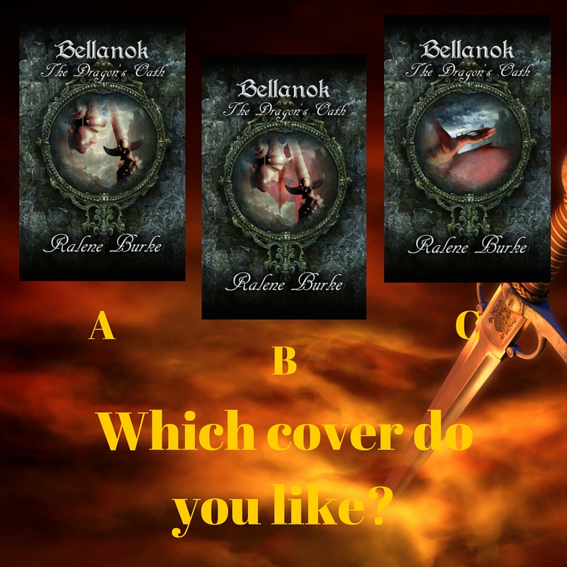
First, I need your help. My good friend and cover designer, J.L. Mbewe, did a fantastic job on some sample cover designs. They’re so great, I can’t choose!
Listed below, I have the 3 possible covers.
In the blog comments, I want you to tell me if you like A, B, or C.
If you comment by Sunday night (May 1), you’ll be entered into a giveaway. The winner will get a free e-copy of all 3 novellas!


C. I like them all, but with the title, I think C fits better.
I like C the best. It fits best with the title and the other covers.
B. It’s the one that grabs my eye. And to be honest, if the title didn’t have the word “dragon” in it, I wouldn’t be able to tell what the picture on C is.
I like C. It fits the title better.
Though C fits the title more, I really like A.
C is my favorite, but they’re all great options!
B or C. I like a picture of a dragon on the cover if you mention one in the title, but B looks cool as it is.
That is a tough decision, but I like B. Since the name of the book is The Dragon’s Oath, I think its good to have the dragon not so front and center. Since the dragon already has the title.That way the focus is also on the hero,Brian, I’m assuming. Not sure if my reasoning makes sense, but there ya go! Thanks for giving us this opportunity to win the e-books!
I completely understand, and that is also why I like B!
I think B is visually the one that is the most appealing. The dragon’s wing in C lacks any detail and comes across as just a swath of red. All of them are nice, but B is the most complete in terms of color and design.
Thank you for your input! I like hearing why one appeals over another.
A is my choice. Can’t wait!!!
C!
I like B. The bit of color behind him adds depth to the cover. I think B is the most visually striking of the three. 🙂
I like C. I like the dragon. And maybe it’s too small on my phone (I can’t seem to get it to get bigger…) but I have a hard time making out what B was in the background. I mean, I figured it out…
I’m torn between B and C
I like C, it matches the title and catches my eye the best 🙂
It seems I’m in a minority here, but I think A is the best! 🙂
Don’t worry. On Facebook, there were a lot of A votes!
B is my favorite I think. I like the coloring and the intensity of it, but my husband’s vote is c. 😉
B,because of the color of red gives it more depth and makes it appealing!
A for my husband and me. Agree with Dana, Hi Dana!, and Josh. Excited, my friend!!!